

I’ve been using Capture One styles from Dave Herring and Very Good Presets for a couple of years now and they always seem to deliver. One of the styles I tend to gravitate towards is Jupiter. There are two presets provided, RGB for color and Mono. I find both are quite lovely.
I recently rented the Sony 16-35/2.8 GM and, while I didn’t have very good weather over the weekend, I headed out to one of our local preserves. Unfortunately, the weather really put a wall up. I’d forgotten that we had a king tide, so the high tide was considerably higher than normal. The preserve is on the Intracoastal waterway and I only made it about 50′ before the path was flooded. I wasn’t feeling that adventurous so I stayed dry and took advantage of other opportunities.
Since this is about the preset, I’ll get into the lens later.
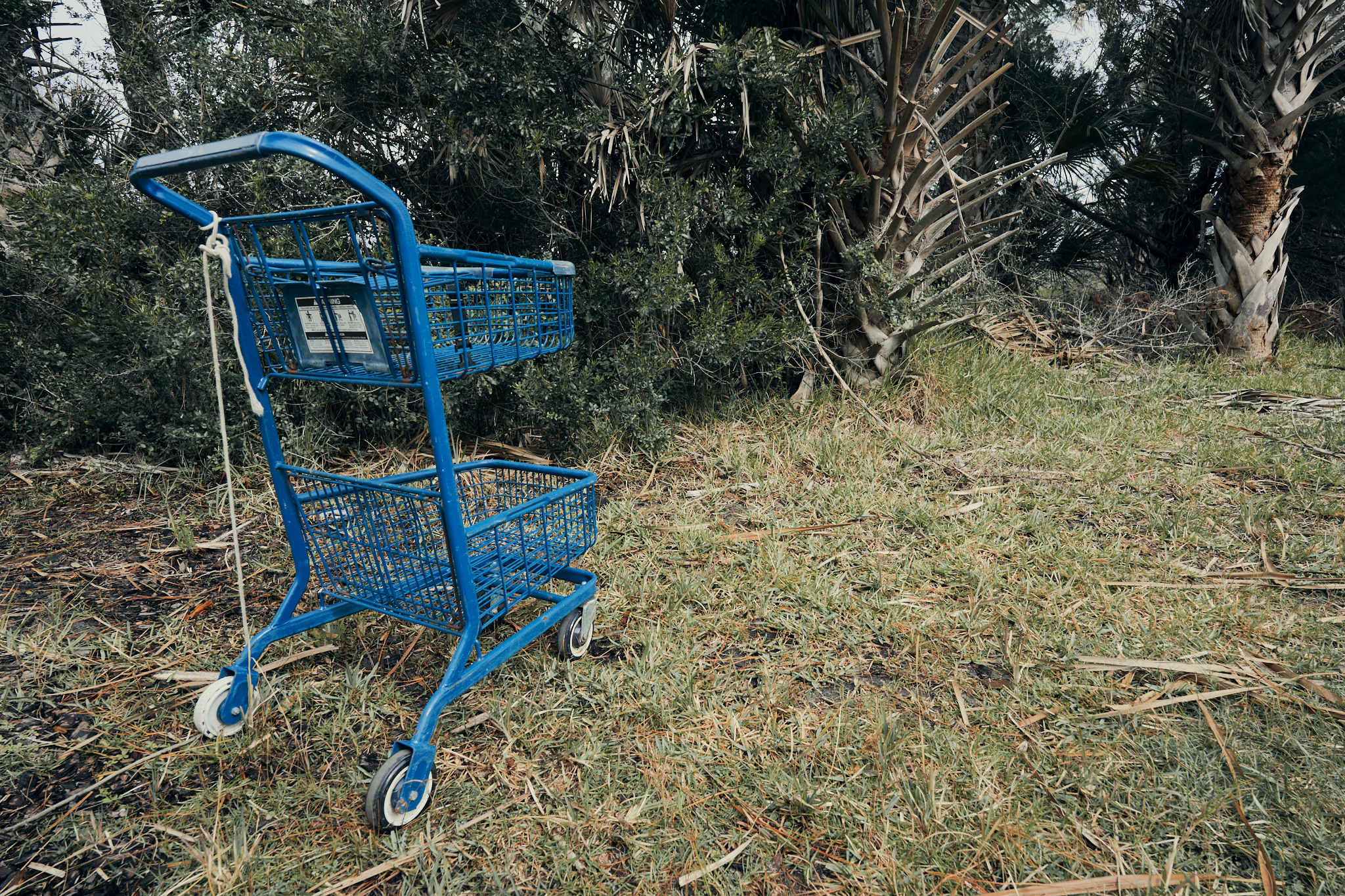
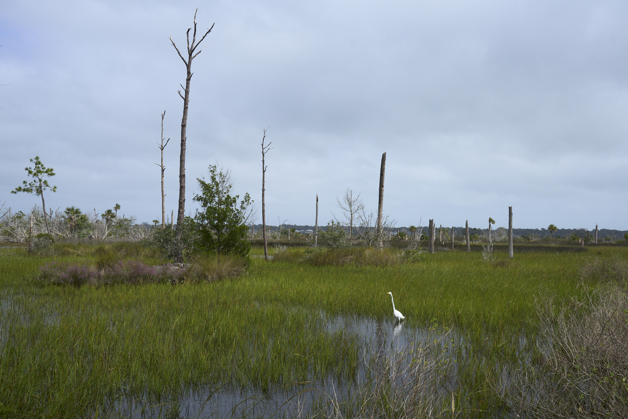
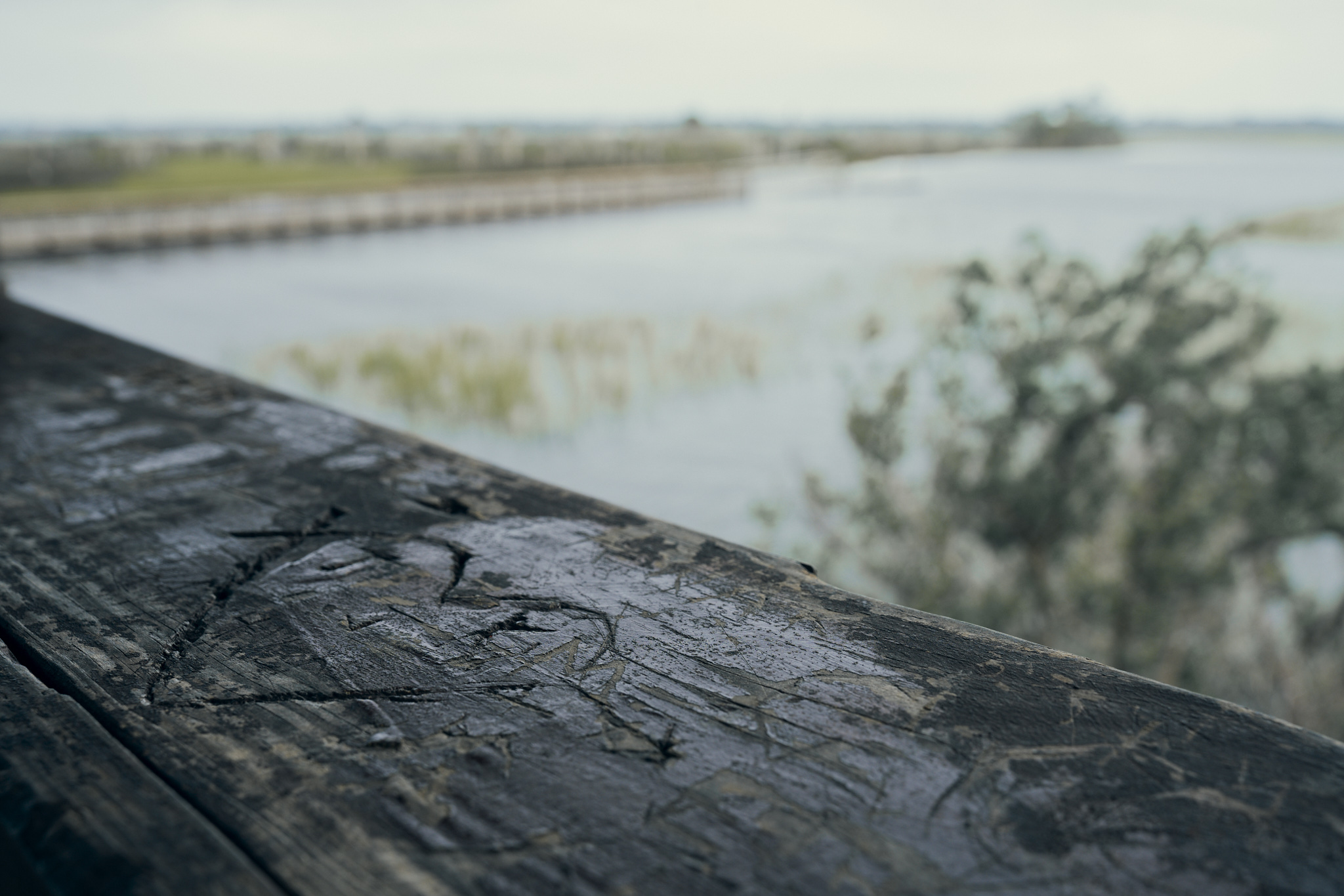
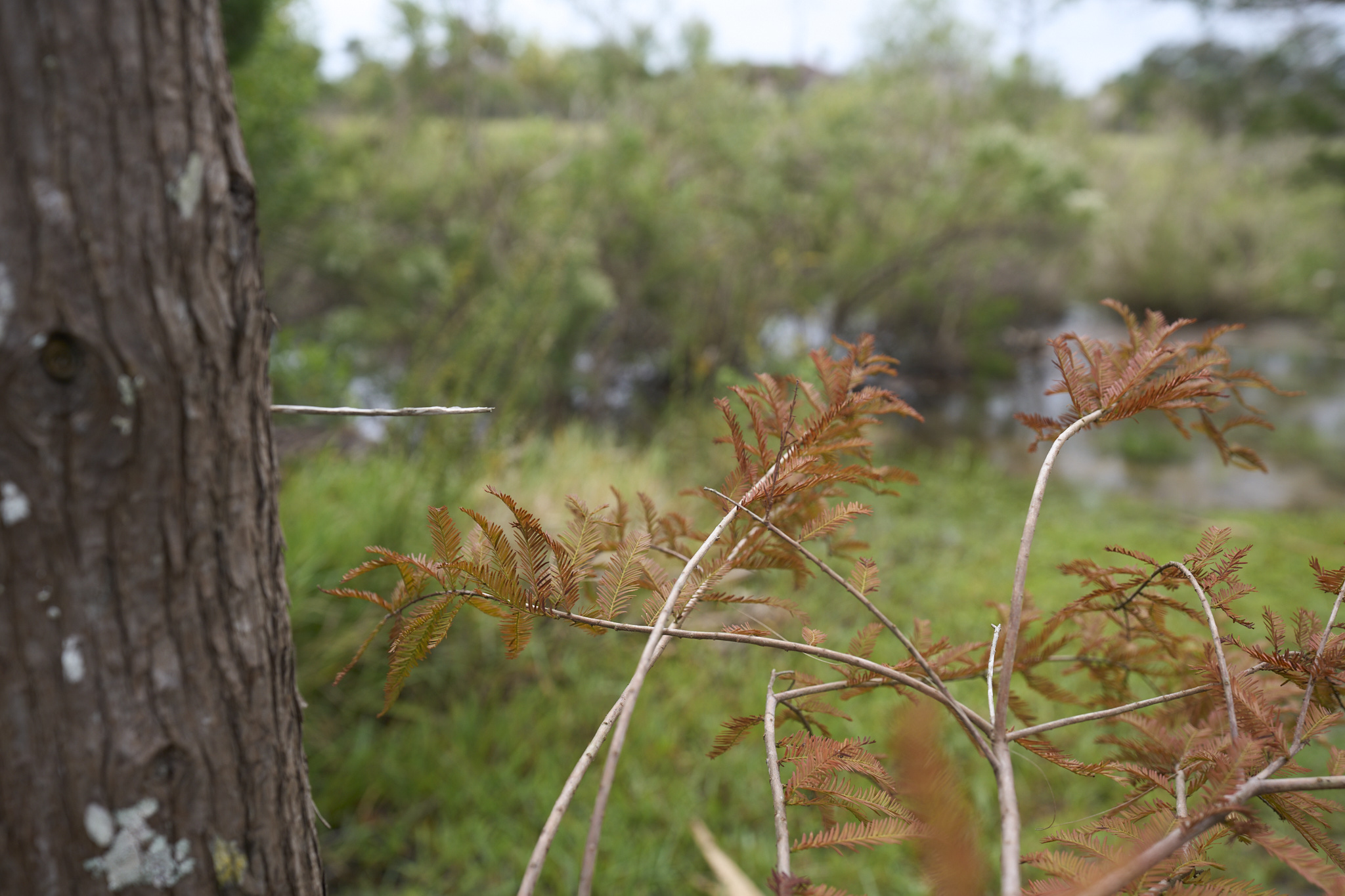
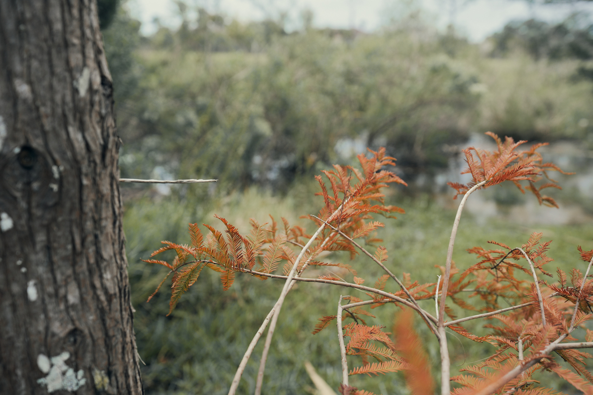
I just thought I’d share a few images so you can see a real-world comparison. All of these were shot with my Sony A7iv.
Jupiter RGB

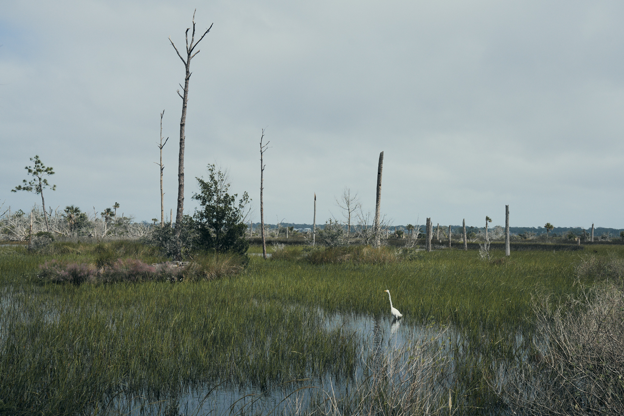
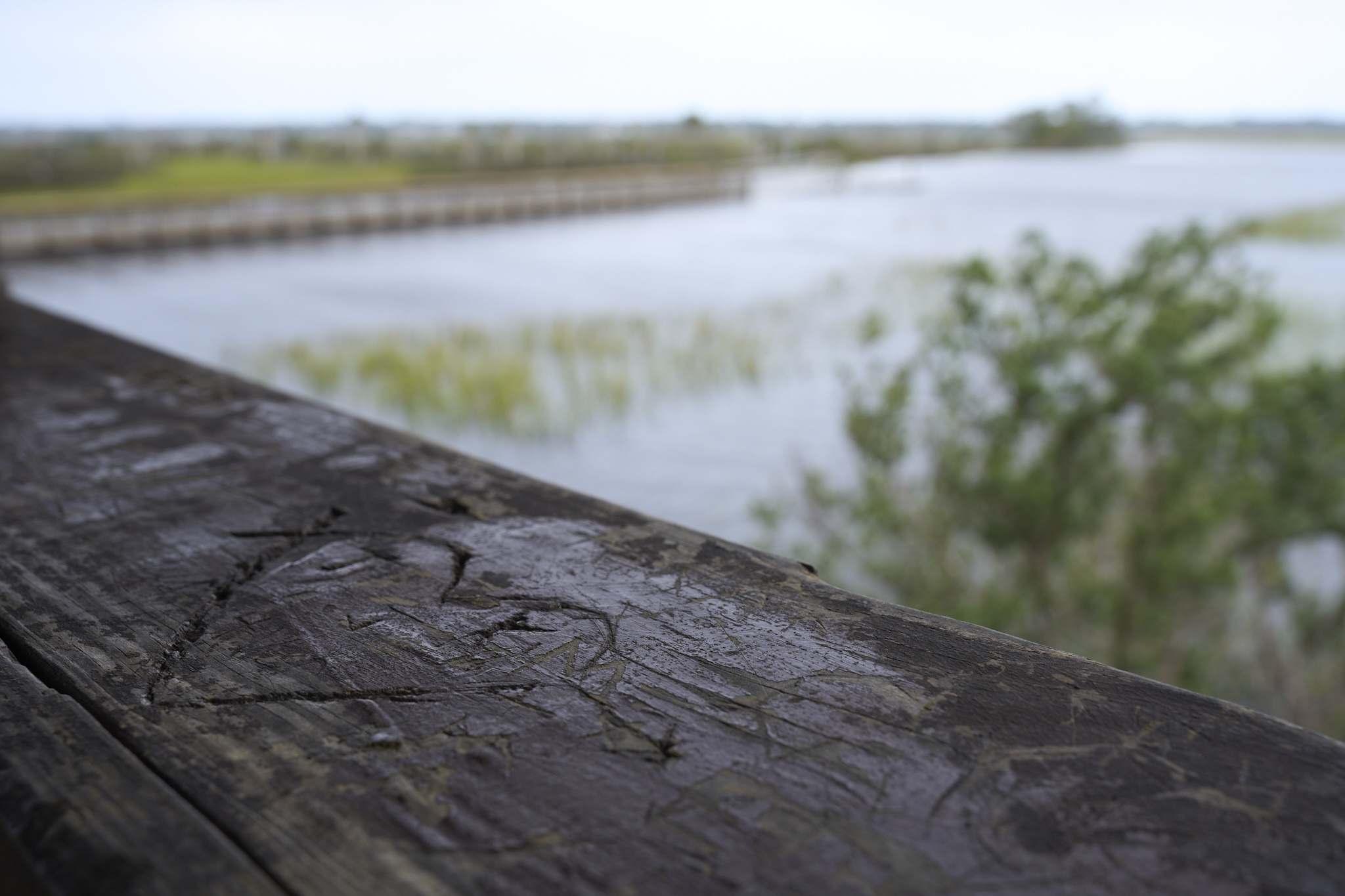
Jupiter Mono + High Contrast
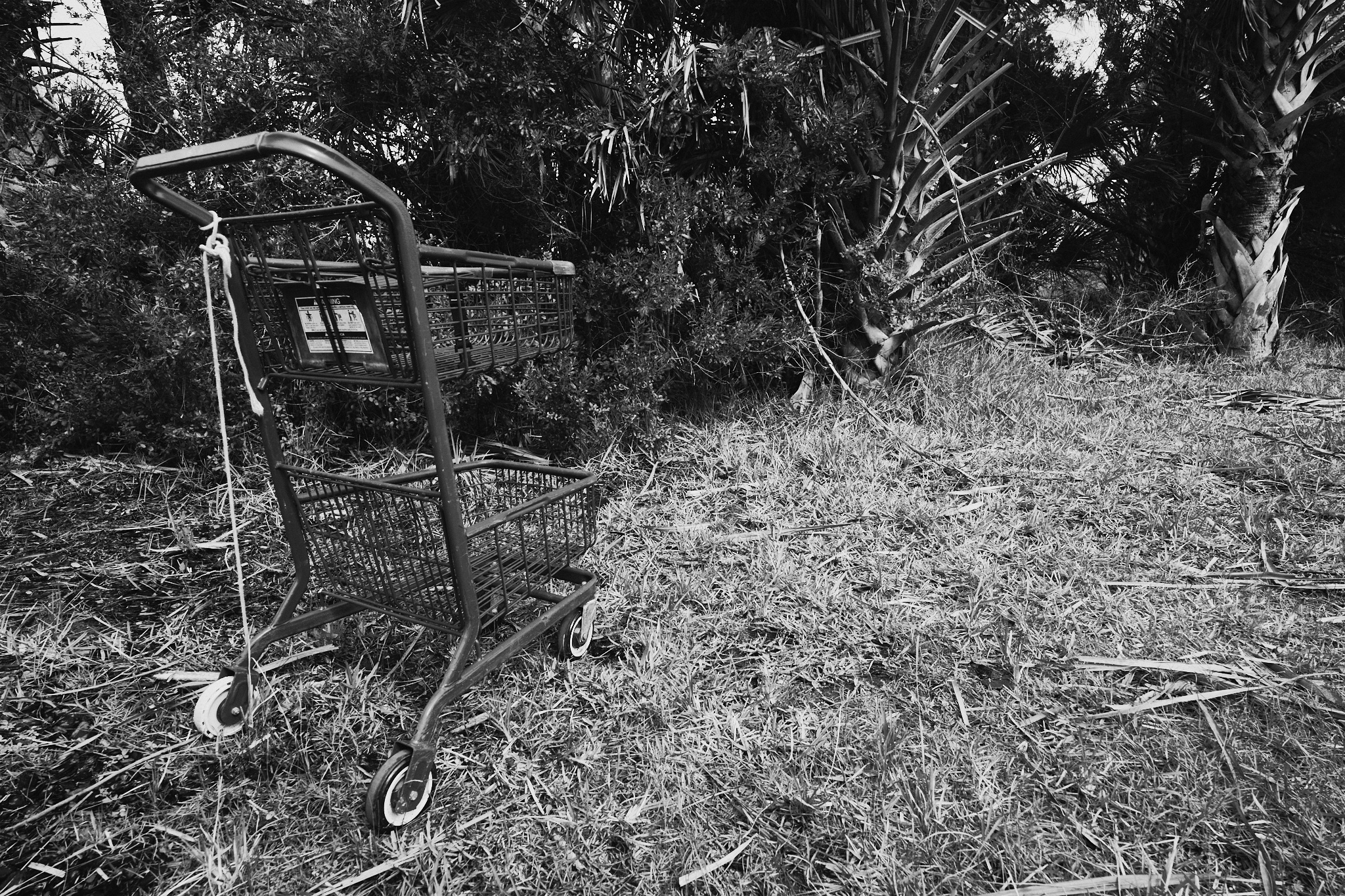
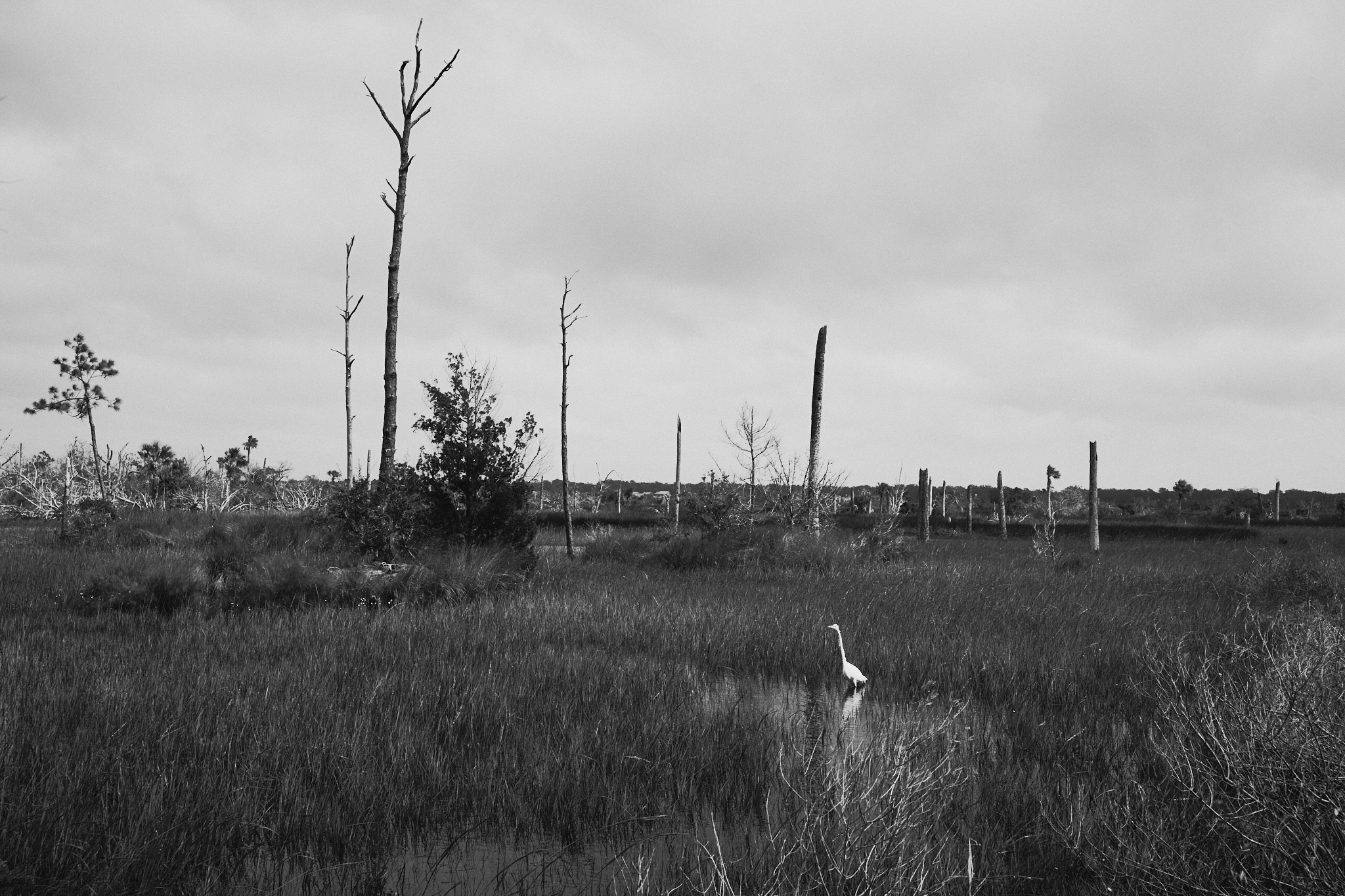
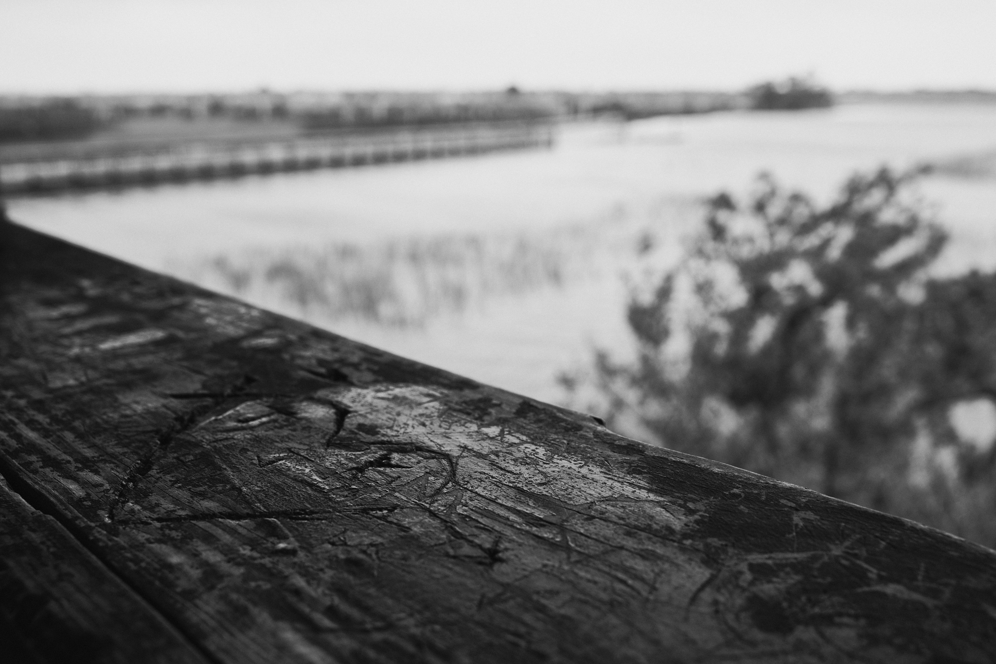
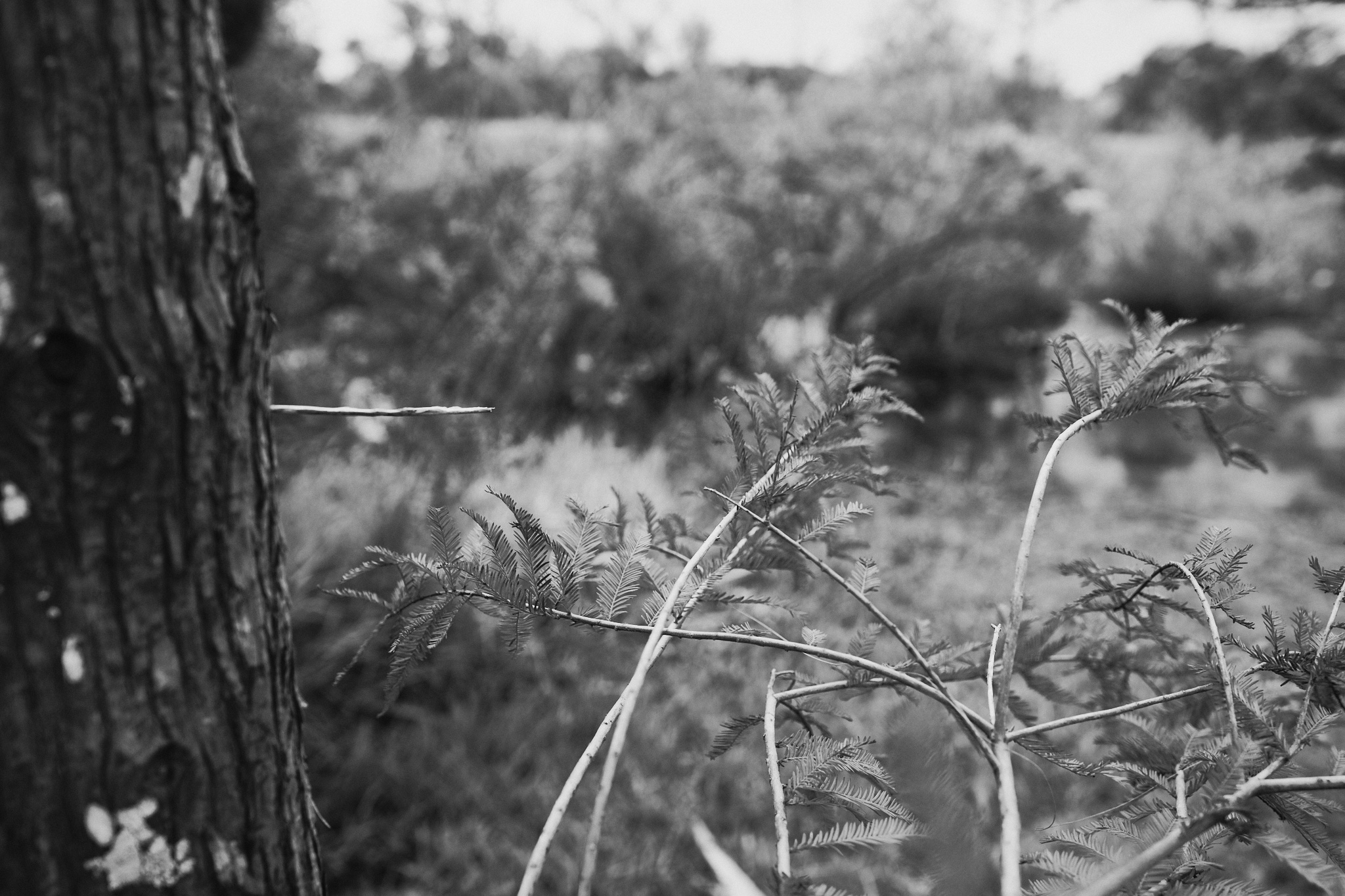
Overall, I’ve been very pleased with this particular style. As I mentioned, it’s probably the one I lean on the most. I think the colors render nicely and the mono conversion is pleasing to my eye. Hopefully this helps give you a little sense of what it might do with your own images.


Sorry, the comment form is closed at this time.